Thursday, March 19, 2009

Alpha Channels: An Introduction


If you have ever found your self selecting and then re-selecting the same portion of an image in Photoshop then you are in dire need of Alpha Masks.

Scenario: Imagine that you are working on a Photoshop project where you had to carefully select something. You took about 10 minutes to successfully select something. Then you worked in the selection for another 10 minutes and then you deselected only to realize that you forgot to apply a stroke (Edit > Stroke) to the image. What now? You’ll have to spend another 10 minutes re-selecting. 

The whole re-selecting process could have been avoided if you had used Alpha Channels to save your selection.

Selecting an Alien Flower

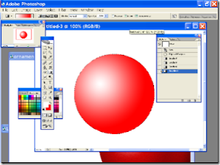
1) Here I have selected what appears to be an alien flower. It took me about five minutes (I selected in Quick Mask mode). I wouldn’t want to spend another 5 minutes re-selecting it in the future.


Saving the Selection For Ever

2) So now I want to save this selection. With a stroke of genius, I glide my mouse pointer with extraordinary skill all the way to the Select menu. While in this menu I click on Save Selection. Tada! I have successfully saved the selection. I’ll never have to re-select that alien flower ever again.

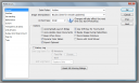
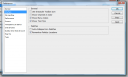
If you did the same then you should see something like the following window appear:


Enter a name and click ok.
Wait? What Happened?

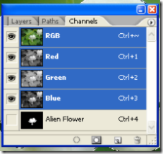
3) Nothing appeared to happen but if you go to your Channels Palette ( Window > Channels ) then you will see an Alpha Channel. This is the saved selection.


Moment of Truth.

4) De-select the current selection ( Press CTRL/CMD+D). Now if you want the selection to come back then just CTRL/CMD+ Click on the new Alpha Channel (called Alien Flower in this example) and your selection will return. Whew!

Not only will this selection re-use allow you to save time but now you have access to a whole new list of channel features.

Some Facts

5) If you click on the Alpha Channel, the entire image will  turn black and white.

The areas that are not selected will be black
The areas that were with in the selection will be white.
The areas that are translucent or partially transparent will appear as shades of gray.


This view is helpful because you can check if you have errors in your selection. If your selection is fuzzy then you can adjust the levels ( Image > Adjustments > Levels ) or sharpen the selection ( Filter > Sharpen > Smart Sharpen ).

You are allowed to use most of the filters and image adjustment tools in this view. You can use this for your advantage and create lots of fun and useful effects. I’ll try to cover some of these in the days ahead. 

You can also use the paint brush, paint bucket, or pencil tool to reshape the selection. If you paint black then that area will get deselected. If you paint white then those areas will get selected. Gray areas will be semi-transparent.

Photoshop Christmas Ornament


The holiday season is fast approaching and people will soon be using Photoshop to create Christmas greeting cards, banners, and flyers. Most of them will probably want to create some pictures of Christmas decorations on those cards. This is a quick and dirty tutorial to get started with creating ornaments


The Magical Color Changing Christmas Ornament

I don’t enjoy doing something over and over. Repetitive tasks get boring so most of the time we should be reusing our work. The following tutorial shows how to make a Christmas Ornament graphic that you can quickly modify in a few seconds.

This is what the end product will look like:

Best of all, if you want to change the color you will just edit one layer and you’ll end up with a brand new Christmas ornament with out losing any of the cool effects.


There.. that literally took 4 seconds.
Let’s Begin 


1) Creating the base layer 

Create a new image ( File > New ). Choose what ever settings you like. I chose the 1024×768 preset.

Create a New Layer. Rename this layer and call it “BASE”.

Choose the Layer called BASE by clicking on it in the Layers Palette.

Grab the Elliptical Marquee Selection Tool

If you hold down the SHIFT key and then drag then you will get a perfect circle. Do that now. Shift+click and then drag on your image. Make a nice round selection.

In your color picker,  Choose WHITE as your foreground color. And choose RED as your background color.

 Now grab the Gradient Tool ( G ) . When you choose the gradient tool you should notice that the top tool bar changes. You will see a Gradient Picker.


Click on that gradient picker area (in the screen shot above it’s the area with the red to black gradient. After you click on it you should see the Gradient Picker window. Choose Foreground to background. Then inside the circle selection make a diagonal line going from upper left to lower right. Keep trying until your circle looks like the following:


Next, go to Filter > Noise > Add Noise. I chose 6% noise, Uniform and Monochromatic.

2) Making it 3D-ish.

Create a new layer. Call it “3D effect”.

Choose the layer called “3D Effect”

CTRL+Click on the layer called “Base”. This will select the circle. Make sure that 3D effect layer is selected. Then go to Edit > Fill > Choose Color in the Use menu > and choose 100% Black as the color.

Now click on the Add Layer Mask button on the bottom of the Layers Palette.

Click on the black colored layer mask next to the 3d effect layer. Choose the gradient tool. Use a Foreground to Transparent gradient. Make another diagonal line inside the selected circle. Keep trying until you get something like this:


You may have to click on delete and try again until you get it looking like the image above.

3) Making the Ring

Create a new layer. Call it “Ring”.

Make a small narrow oval selection on top of the orb and fill it with a color. I chose yellow. It should look like this:

 
Choose the move tool.

Now press ALT and the up arrow. This will duplicate the selection and nudge it upwards.

Press up until the little ring is high enough.

And the end choose Select > Modify > Contract. Enter in a number like 3 pixels and then fill it with black.

You can also apply a reflected gradient on this ring.

You should end up with something that looks like the following:
4) Making the final Glow

Make a new layer. Call it “Glow”.

Control click on Base. This will select the circle.

Go to Select > Save selection. Name should be Circle 1.

Grab the marquee tool and click and drag the selection slightly to the left.

Now click on Select > Save Selection.

This time in the Channel drop down menu choose Circle 1.

Operation should be Subtract from selection.

Go to the channels palette and click on Circle 1.

You should see something like the following:

Go to Filter > Blur > Gaussian Blur. I blurred mine 34 pixels. This may be different for you depending on what size you are working with.

Control Click on Circle 1 channel and then go back to the Glow Layer.

Click on Edit > Fill and fill it with WHITE. Finally change the blending mode for this layer to Overlay. Move this layer until it looks good.

5) Changing Colors.

If you want to change the colors of this ornament just click on the BASE layer. Then go to Image > Adjustment > Hue Saturation. Move the Hue slider and the color of the orb will change. All the glow effects will remain.

Saturday, March 14, 2009

Creating Curves with the Pen Tool


Learn how to create smooth curves using the Pen Tool. It is recommended that you follow along on Photoshop while reading this article. This will make the learning experience much more enjoyable


We will create a simple curved line using a pen path. I recommend that you follow along on Photoshop to learn about pen paths. Start by creating a new Photoshop Document (File > New).  


Path Basics

1.          
.             Choose the Pen Tool 
Choose “Paths” from the tool options from the top. 
Click and release your mouse multiple times, on random locations, on the new document. 
The tiny squares at the corners are called Anchor Points. Anchor Points exist to connect different path segments and to modify the way they look.
Create another anchor point but instead of just clicking, press and then hold the button down and then drag your mouse cursor any way you want. Drag in multiple directions and you’ll notice that the path segment curves and bends depending on how you drag your mouse cursor. If you drag away from the anchor point then the line gets a greater curve. The curve travels with the straight line no matter which way you rotate it.


Creating Perfect Curves
We will now finally create an actually smooth curve using the pen tool.

1.
Choose a brush setting. Set the size and color of the brush. I chose size 15 and color black (#000000). 
Choose the pen tool.  
Click once to create an Anchor Point. Next, Create another anchor point but instead 
of just clicking, press and then hold the button down and then drag your mouse cursor until the curve looks the way you want it to look. Repeat at other locations for more curves until you are happy with your single smooth curve.  
Right click on the curve and choose Stroke Path. 
Choose Brush from the drop down 
menu. If you want a constant straight line with constant opacity then uncheck “Simulate Pressure”. Otherwise, leave it checked.

Finally, you can right click and delete the path. If you wish to preserve the path, you can click on View > Uncheck Show Extras. This will preserve the path but you won’t see it on your image. You can bring it back by going to View >> Show Extras. You can access the Paths Palette by going to Windows > Paths.


Photoshop Preferences


In order to get the most performance out of photoshop, you should check out the photoshop preferences. Let’s go ahead and explore the most important settings in the preferences window of photoshop. If you are in a hurry then scroll down and do the stuff that is in Black font in order to increase the performance of Photoshop.

Go ahead and open the preferences window. Windows users should go to Edit > Preferences > General or use the keystroke CTRL+K. Mac users should go to Photoshop > Preferences > General or CMD+K.


  I am using Photoshop CS3 so if you are using a different version of photoshop then your preferences window will probably look different. But don’t worry, most of the settings will be the same though they may exist on different tabs so click around and explore on your own until you get to the settings that this tutorial talks about. If you are using Photoshop CS and above then you should be okay. Just feel your way around.

The following is not a complete tour of the Photoshop Preferences. I have only covered what I believe to be the most important settings for the average Photoshop User.


General Tab.
                                   
 Color picker: This setting chooses between which algorithm should be used by the color picker. The options that I have are Windows or Adobe. I set this as Adobe.

Image Interpolation: This option is used to decide which algorithm photoshop uses when resizing an image.  

  • Nearest Neighbour makes the pixels larger or smaller. This usually makes jaggies more visible.
  • Bilinear Interpolation determines the averages of pixels and then creates a new pixel based on the results. This produces almost no jaggies but makes the image blurry.
  • Bicubic Interpolation is the default setting and should be a good setting for everyone. It creates sharp edges and not many jagged edges. Photoshop CS and above has two variants of Bicubic Interpolation, the Bicubic Smoother and Bicupid Sharper. Bicubic Smoother is optimum for enlarging images and Bicubic Sharper is optimum for reducing an image. None of these enlarge images very well. They will end up making your images blurry but that is where many current enlarging algorithms are currently. My advice would be to just keep Bicubic Interpolation. If you mainly do image size reductions then you can decide if you would like to set it to Bicubic Sharper.


General Options: Most of these are entirely upto you.

Automatically Launch Bridge: Check this option only if you use Bridge to manage your images and photographs. If not then launching Bridge automatically will just slow down Photoshop’s start time.

  • Auto Update Open Documents: If you use multiple image editing programs then turn this on. It is useful if you use Imageready or another image editor while using Photoshop. If not then never mind.
  • Automatically Beep: This is useful if you are using massive images and single photoshop commands take many minutes to complete. Then you can just give the command and do something else and photoshop will beep to let you know that the command is complete
  • Dymanic Color Sliders: I would recommend that you check this. When you move sliders, you’ll see the colors change in real time. Other wise they will only update once you change and release the mouse button.
  • Export Clipboard: I would recommend that you UNcheck this. This will free up your clipboard and leave more memory free. Only check this option if you copy and paste items from inside photoshop to other programs.
  • Use Shift Key For Tool Switch: This is entirely a personal preference. If you leave this CHECKED then you can press for example Shift L to select the lasso tool. While holding the shift button down you can press L agains and again to flip through all the other tools under the lasso tool (Polygonal Lasso and Magnetic Lasso). If you UNCHECK this then you just press L to select the lasso tool and then press L over and over to flip through the lasso tools. You’ll save a nano second if you uncheck this. I prefer unchecking it.
  • Resize Image During Paste/Place. I would recommend that you check this. This allows you to free transform an image as soon as you Paste or place an image.
  • Zoom resizes window. I leave this UNchecked. If checked then it resizes the window along with the image when zoomed.
  • Zoom with scroll wheel. I leave this UNchecked. This is personal preference. I usually resize images with the slider on my Wacom Intuos 3.
         History Log: This is useful if you want to save all the steps that you made while creating your images. It will tell you exactly what tool you used and applied which filter and what order you made the changes. This is very useful you are writing tutorials or just want to remember exactly how you made what you made.

  • MetaData: This will save your history log in the image itself. This will make the image file size slightly bigger. This information can be viewed in the bridge or any other program capable of displayign image metadata (irfanview)
  • Text File. Saves the log into an external text file.
  • Both: Saves the log into both the image metadata as well as an external text file!
Interface Tab


Use Grayscale Toolbar icon: This turns the “PS” above the tools from Blue to Gray. If the color is distracting to you then go ahead and check this.

Show Channels in Color: Check this if you want to show individual color channels in color. The default is unchecked.

Show Menu Colors: Check this if you want to show background colors in menus

Show Tool Tips: These are the tips that appear if you hover your mouse pointer over something. If you are a beginner or intermediate Photoshop user then leave this checked. If you find them getting in the way then go ahead and uncheck this.

Auto Collapse Icon Palettes: This will hide your palettes if you click anywhere else. This is useful if you feel that the palettes get in your way. I recommend that you Uncheck this. You’ll save a lot of clicks if you keep this unchecked.

Remember Palette Locations: I recommend that you leave this checked. It will allow you to better personalize photoshop according to your needs. If unchecked then all palette locations will get moved back to default between photoshop runs. This is a useful setting to have for shared computers such as in lab environments.

File Handling


Image Previews: Saving an image preview will increase the file size slightly. This is the thumb nail that appears when you click on an image in File > Open. I recommend setting this to Always Save.

File Extension: I have this set to use lowercase. I am not sure why it would be important for anyone to use upper case. Please share in the comments if you know why saving in upper case would be important for someone other than just a personal preference.

Recent File List Contains: I have set this to 15. You can increase the number to 25. This is convenient if you open a lot of files and want easy access to them from File > Recent Files >

Performance


Memory Usage: If you have RAM to spare then increase this to 70%. This will greatly increase performance. This will reduce the performance of any other programs that you might you using. Your decision regarding this option greatly depends on how you use Photoshop. If you close all other programs and only work on Photoshop then increase this to 70% or 75%. If you use other programs while using Photoshop such as a web browser, Dreamweaver, or any resource hungry program then you’ll probably be better off setting this to 55% to 69%. You always want to give photoshop as much memory as you can for the best performance.

Scratch Disks: The best performance can be achieved if you have two internal hard disks in your computer. The second best performance can be achieved if you have one internal and one external harddisk connected by a fast connection such as USB2.0 or Firewire. The least would be to have one hard disk with free space. So if you have two internal physical harddisks in your computer then set the scratch disk to where photoshop is not installed. Example, If photoshop is on X:\ (or sda1) drive then make the scratch disk on Y:\ (sdb1) drive.


ABOUT TOOLS

Get Smart with Smart Objects

Photoshop has been moving towards letting users do everything non-destructively. The biggest advantage digital artists have over artists that use other mediums is the ability to go back and fix things with out having to start over. Smart Objects is the latest tool in our powerful arsenal that allows us to do a whole lot very quickly without any fear of doing any irreversible damage. As all other tutorials on this site, we’ll go ahead and learn about Smart Objects by jumping right into Photoshop to explore this topic.

Smart Objects are Links

Those who have some experience with creating web pages will be familiar with the image tag. When one wants to add an image into a website, they will use the tag and link to an image. Then they are free to change certain image properties such as the size or borders using CSS. They are also able to create multiple images by adding multiple  tags on to a web page. This creates multiple instances of the same image on to one web page. If someone edits the actual image file that is being linked to using the tag, then that edit will be reflected on all the instances of that one file.


Step 1:Choose an image to work with.

Next, I opened a new blank image by going to File > New. Next, using the move tool, I clicked on the originalball.jpg layer and dragged it into the new image. This created the following:


Step 2: Here is a regular layer

After increasing the canvas size a bit, I added a Smart Object next to the regular layer. To do so, go to File > Place and choose the originalball.jpg image. This created the following:


Step 3: Add a smart object

They look identical at the moment. I can see the layers palette. The icon for the Smart Oject is different than a regular layer.

Next, let’s try resizing both the regular layer and Smart Object multiple times. Transform both objects to half their size, then resize both of them to three times their size, then resize them back to their original size. Now if we inspect the edges of the regular layer and the smart object, this is what we find:


The Smart Object retains its original sharpness and quality

You can clearly see, that the Smart Object edges are just as good as the original while the regular layer has degraded and blurred after just a few transformations. This is because a smart object resamples the original image during each transformation while a regular layer only transforms the current state of the layer and causes degradation.

You can also add multiple copies of a Smart Object on to the canvas by right clicking on a Smart Object Layer in the layers palette and then clicking on “Duplicate Layer”. Next if you double click on one of the copied Smart Object Layers in the layers palette, it will open that layer in a new window and give you the following warning:


Double click on Smart Object layer to edit

Click on “OK” and the original image will open up in a new window. Edit that image and then click on File > Save. Next, return to your image with the smart object, and your change will be reflected in all the instances of the Smart Object. This is useful for example when you may be editing buttons for a navigation menu.

You can also convert any existing layer into a Smart Object by right clicking on the Layer in the Layers palette and clicking on “Convert to Smart Object”. The layer can then be used as a Smart Object.

Also, you can not use the paint brush directly on a Smart Object. You must either rasterize it or double click on Smart Object Layer in the Layers palette in order to directly edit it.

Smart Objects have further features as well and I’ll cover them in my next post about Smart Objects. I hope you found this introduction to Smart Objects helpful. Leave a comment if you wish!